
Experienced online marketers schooled in visual trends know full well that the old axiom which says “a picture is worth a thousand words” is entirely false. They’re worth considerably more than that.
According to research conducted by 3M, the human eye is capable of processing visuals approximately 60,000 times faster than the written word. This ability serves us well as we orient ourselves traversing treacherous terrain, such as the inherent perils of the average metropolitan freeway at rush hour.
However, one can hardly overstate the importance of words and using them well. Likewise, we all know that online marketing and novel writing are very different endeavors. In the world of buying, selling, and browsing, compelling visuals rule the roost.
The necessity of business owners keeping up with current visual trends is very real. It takes on new levels of urgency when competing in the arena of eCommerce. After all, UCLA psychology professor Albert Mehrabian effectively demonstrated that up to 93% of all communication is nonverbal.
Of course, very few people would say that the words we use aren’t critical. We all know they have value. If you’re a lover of words and economy in language, those skills are in high demand right now. However, the first step in the world of online retail is convincing users to halt their mindless, endless scrolling and give those words a chance to offer detail. Here are seven tech trends to be aware of as you seek to take your business to new heights.
1. Infographics
It might be helpful to think of infographics as something of a “midway point” between words and images. Infographics frequently appear in technology publications as a means of quickly conveying numerical information as it relates to everyday experiences. Their underlying messages entirely bypass the written word and immediately map to the human brain.
Simply stated, well-done infographics can rapidly convey a sense of scale. They offer visual comparison that merits the attention of anyone interested in the topic at hand.
You will often find infographics used to good effect in finance publications as well. In addition to helping readers acquire a sense of scale, these visual devices benefit from the proven ability of the dollar sign — or other markers of currency value. They signal audiences to slow down and reconsider moving too quickly past vital information.
Need proof? Spend some time at your local grocery store observing how others are subconsciously “steered” by discount and rebate signage.
2. Animation and Video
Few things catch the human eye faster than motion. Visual designers use this reality in social media and online media to draw attention without becoming intrusive or overbearing. Additionally, the recognition that audiences prefer to remain in control of their experiences online has sparked new levels of creativity tempered with restraint.
Similarly, the recent reversal of fortune at YouTube gives evidence that they may have overplayed their hand when it comes to monetizing videos with “unskippable” ads. YouTube, TikTok, and similar video services rose to prominence with younger audiences. This happened precisely because they catered to increasingly short attention spans.
It would seem perhaps that ad revenue blinded them to the initial reason for their success. Nowadays, users are fleeing YouTube in droves. Inserted ads have overtaxed their patience. As you look to use video marketing for your company, keep this cautionary tale somewhere in the back of your mind.
And we’re way past the era of Flash. Visual designers long ago abandoned the idea that users would be willing to download and install specialized software to view their creations. The average consumer will bounce the second they are asked to cooperate in any way with your design agenda. Instead, the increased use of SVG files, HTML 5.0, and applets to facilitate visual movement has taken end-user experience in directions previously not thought possible.
3. Increased Use of Gradients
For this cultural moment, anyway, it seems that our increased use of screens has led to a resurgence in the use of color gradients to add visual interest. Images that transition gradually from one color or shade to the next work to draw the eye of the viewer in the desired direction.
In previous decades, designs that incorporated gradients ran the risk of being wrecked by using low-resolution devices. The “banding” that often accompanied our earlier use of gradients has since been chiefly eliminated. This has been made possible by the advent of greater screen resolutions on consumer-level tech.
Increased reliance on gradients has allowed visual designers to use them in obvious and subtle ways. On the more obvious side, just about everyone can point out the use of a gradient as a backdrop. However, designers increasingly use them in logos, presentations, brand books, and even business cards.
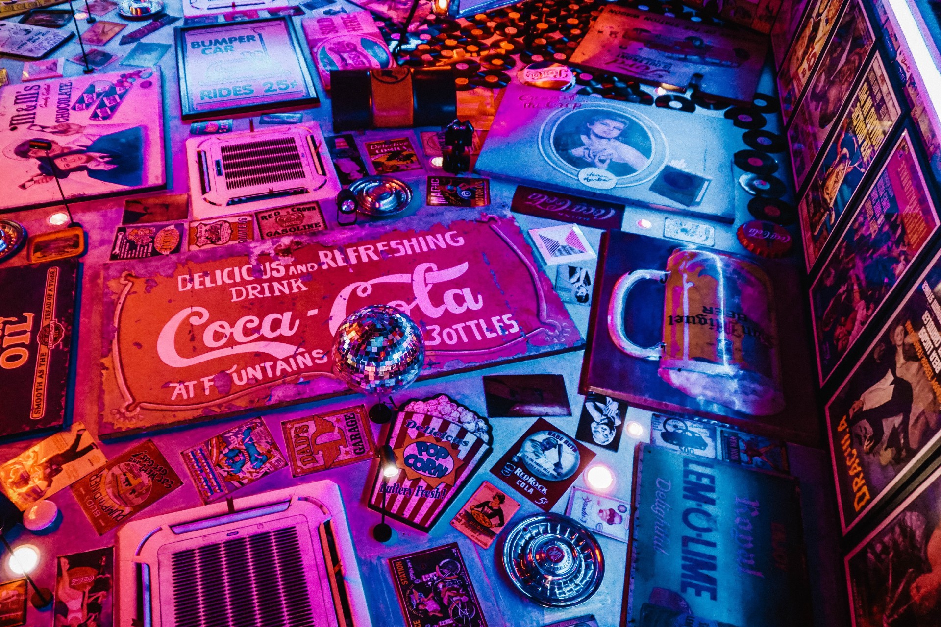
4. Nostalgia
It’s a proven fact that tough times in the present era create a nearly-unquenchable appetite for “simpler” days. Never mind that this all-too-common human response mechanism isn’t typically grounded by the harsher realities of days gone by.
For example, you will often hear car enthusiasts lamenting about the boxiness of modern vehicles. They pine for the era of tail fins, the Chrysler 440 engine, or a “three on a tree” transmission. Of course, it’s easier to be sentimental once you allow yourself to forget about the advent of increased fuel efficiency, enhanced safety features, and satellite-powered navigation.
So it’s no surprise that the Covid-19 pandemic — followed by record-setting inflation and other economic woes — has kickstarted an increased reliance on nostalgia in visuals. Even though users consume various small business publications on an iPad, their eyes will be drawn to visuals that inject a touch of nostalgia into their online reading.
Perhaps the most obviously successful example of nostalgia-themed marketing was the 2016 introduction of the Nintendo Classic Mini. The backward-looking video game device immediately struck a nerve with young adults. These consumers grew up playing simple games with low-resolution graphics, clunky controls, and extremely limited capabilities. Consumers who grew up in the 1990s loved it! Nintendo sold 3.6 million units within two years. Go figure.
5. Include Charitable Endorsements and Community Commitment
Just about everyone is trying to sell stuff online. However, not everyone is out there trying to make a positive contribution and promote the well-being of the communities in which their businesses are situated.
The rise of too-often-maligned Millennials and Gen Z to places of prominence in the workforce has been at least one factor resulting in an increased focus on not just doing business successfully but doing business for the benefit of others.
What does this have to do with visual imagery? How does an increased focus on benevolence influence how companies present themselves online? As it turns out, plenty.
Online marketers are quickly discovering that today’s consumers are eager to do business with companies that do more than provide quality products and services at competitive prices. They also want to support businesses that improve lives beyond their bottom line. Many consumers are willing to pay more to ensure they support ethical manufacturing, fair labor practices, eco-friendly packaging, and equitable treatment of others.
Navigating this visual design trend is admittedly a bit tricky. Yes, you can (and should) use photos and other marketing imagery to highlight your company commitments.
However, neither do you want to overplay your hand. You definitely don’t want to come off as a poseur. Zappos provides a great example of a business that has its commitment to helping others baked into everything they do, including its imagery.
6. Consistency…Balanced by Variety
Through endless repetition, your brand needs visual trends guardrails to maintain and reinforce its online identity. However, you will also want to let your design folks know when it’s OK to do a little “off-roading” from time to time.
As mentioned above, concerning highlighting positivity in your messaging, there’s a balancing act between consistency and variety that requires careful attention to detail.
For example, you will want your visual designers to leverage trends to the standards you’ve previously set down in your brand book. In short, that guide should help your designers understand where standards absolutely cannot be violated (colors, fonts, logos, etc.) and where they have room to play around a bit. And you need to allow your team — in-house or outsourced — freedom to try new approaches lest your message grows stale.
7. QR Codes
Let’s say you need to convey a lot of information about your product, services, or upcoming event. The details are targeted to those who have already expressed some interest. However, the medium you’ve chosen doesn’t have much space for long text blocks.
For example, let’s say your brand hosts or attends live events, even if only occasionally. That being the case, your online messaging needs to consistently call attention to this.
Suppose your company has paid for a booth at an upcoming trade show. Of course, you are promoting this opportunity to meet face-to-face with blog articles, LinkedIn posts, and your social media presence. However, is there any reason not to include pointers to this on your packing slips, email receipts, and social media? All you need is a catchy tagline and a QR code.
Using custom QR codes is a great way to convey a great deal of information. You can do this without relying on lengthy blocks of text. More and more consumers are waking up to this trend. They are using their smartphones to engage with brands. Audiences enjoy the freedom to find out more (or not) without having to wade through much of what they consider hype.
Wrapping Up
These days, many small- to medium-sized business owners are quick to share a similar lament. It goes something like this:
“I did not start this business thinking that I would need to hire an army of graphic artists just to compete online.”
While that sentiment is 100% understandable, it nonetheless ignores the fact that millions of potential customers are now using their smartphones to save themselves steps and drive time.
Thankfully, visual design services of all sizes are springing up to meet the need.
Regardless of the size of your company, it’s a safe bet that with a bit of digging, you will be able to outsource your visual design trends to an experienced expert. Yes, the “picture worth a thousand words” axiom needs a bit of retooling in the wake of online shopping. However, another shopworn cliche is moving up in importance: “Advertising doesn’t cost…it pays.”
Don’t make the mistake of selling yourself short by skipping over this budget item. If you offer great products or services at competitive rates, an increased focus on current visual trends can help you combat the menacing evil of rapidly-scrolling thumbs. With just a bit of expertise and attention to detail, you’ll find just the right combination of vital information and arresting imagery. This will cause others to give you slightly more than half a millisecond of attention.
Featured Image Credit: Mikechie Esparagoza; Pexels; Thank you!






Nik Fowler-Hainen
Nik is the Chief of Growth at Calendar.com. He guides people on using Calendar to make scheduling a breeze and to save valuable time. He is also the Head of Customer care and lives with the customers to help them optimize their workspace and hear their feedback to make Calendar the best tool possible. He is always looking for new challenges and ways to better himself as well as the lives of people around him.